How to develop a widget
Prerequisites
We do our utmost to ensure that an integration project can progress rapidly but for this to happen, the person or people in charge of the subject must possess certain skills, knowledge, and tools to develop a widget:
-
git
-
node version 8.12
-
yarn version 1.10.1
-
Basic skills in web development:
-
Html
-
Css
-
Javascript
-
-
Ideally, knowledge of the reactjs framework, as well as typescript, will help accelerate development, but this is not strictly necessary as we will supply you with a project that allows you to generate a “simple” widget in which you only need to modify the “html” rendering in order to present your data source.
-
A web development environment (for example: visual studio code)
Environment setup
Before beginning development, you need to retrieve the integration-template-widget
project, which serves as the basis for your project: you can retrieve it from
the following address:
https://github.com/TalentSoft/integration-widget-template
-
Clone and open the
integration-template-widgetproject -
Open a terminal and execute the following command:
yarn installCheck that a new folder named
node_moduleshas been correctly created in your project root directory, it will contain all the widget’s required dependencies. -
Compile your project by executing the following command:
yarn buildCheck that a new folder called
disthas been correctly created in your project root directory. This new folder will contain the deliverable of your widget as a js bundle. -
Launch the widget testing tool by executing the following command:
yarn display
You can now view your widget by opening a browser and navigating to the following address: http://localhost:5555.
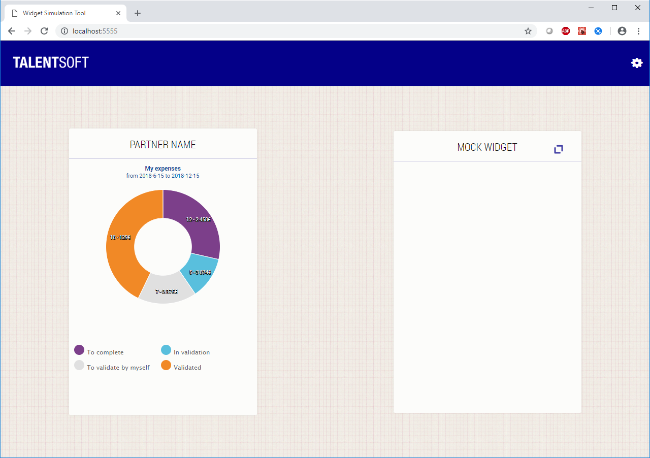
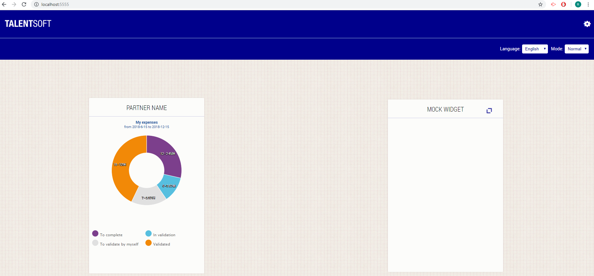
You can change the default port number (5555) by editing the display.js file.
Use existing templates
4 types of templates are implemented for displaying your data in the widget.
Thoses are : List, List-Enlarged, Table and PieCharts. They are available in the app/template folder
There is also a default search component ready in app/components.
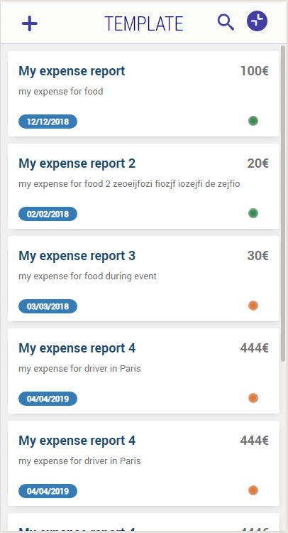
List: React component that takes 3 different parametersshowPicture (boolean): if you want to show avatar on each lineshowDetail (boolean): if you want to show the different status on each linevalues (Line[]): A method that formatted data as an exemple is created : formattedDataForList
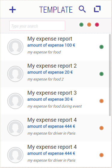
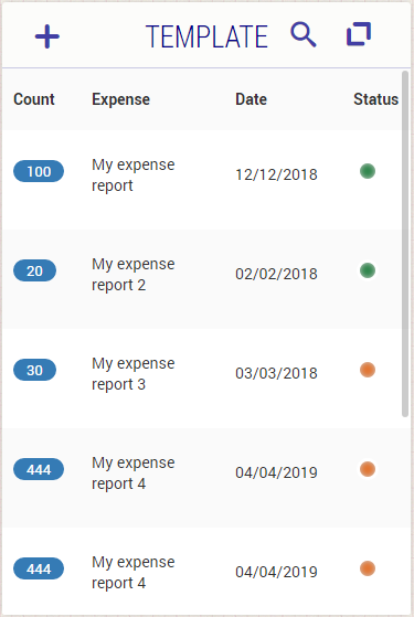
Table: React component that takes 2 different parameterscolumns (Column[]): it is an array of all columns diplayed. Column type contain a name of column and the size (width) of the column. A method that formatted data for column as an example is created : formattedColumnsForTablevalues (Value[][]): it is a 2 dimensional array of Value. Value is a object type that contain a type (enum ValueType) for the type of data used and a value (string | number | boolean) A method that formatted data as an exemple is created : formattedDataForTable
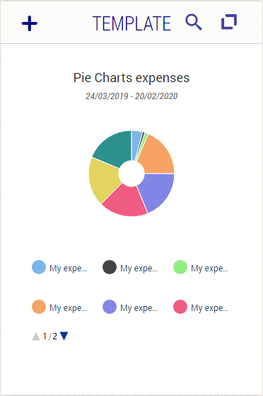
PieCharts: A React component who display a pie chart, it takes 4 different parametersdata((number | [number, number] | [string, number] | [string, number, number] | [number, number, number])[]): the formatted data for PieCharts component (example : formattedDataForPieChart)title (string): The title displayed above the pie chartperiod (string): The period displayed between the title and the pie charttooltip (string): The tooltip used for each data on the pie chart
Search: A React component provided for the default search. It takes 3 parametersisVisible (boolean): Mandatory parameter to display the search bar when you click on the search icon in the header of widgethandleChangeSearch ((textToSearch: string, statusToShow: StatusAvailable[]) => void): callback method used for the search in the component. It's mandatory; an example is provided : handleChangeSearch(textToSearch, status)status? (StatusAvailable[]): Nullable parameter to search on different status. An enum is used for status available : Status in app/component/Search/Status.ts that provide all the status you are going to use in the search. StatusAvailable type has 2 properties : value(Status) and show(boolean). It is used for the selection of the status in the search bar that filter data.

For enlarged Widgets, the project provide 2 kind of templates :
List-Enlarged: A React component who display enlarged list. That list is clickable and show detail for the selection.showPicture (boolean): if you want to show avatar on each lineshowDetail (boolean): if you want to show the different status on each linevalues (Line[]): the data formatted for the component, an example in the method formattedDataForList is created
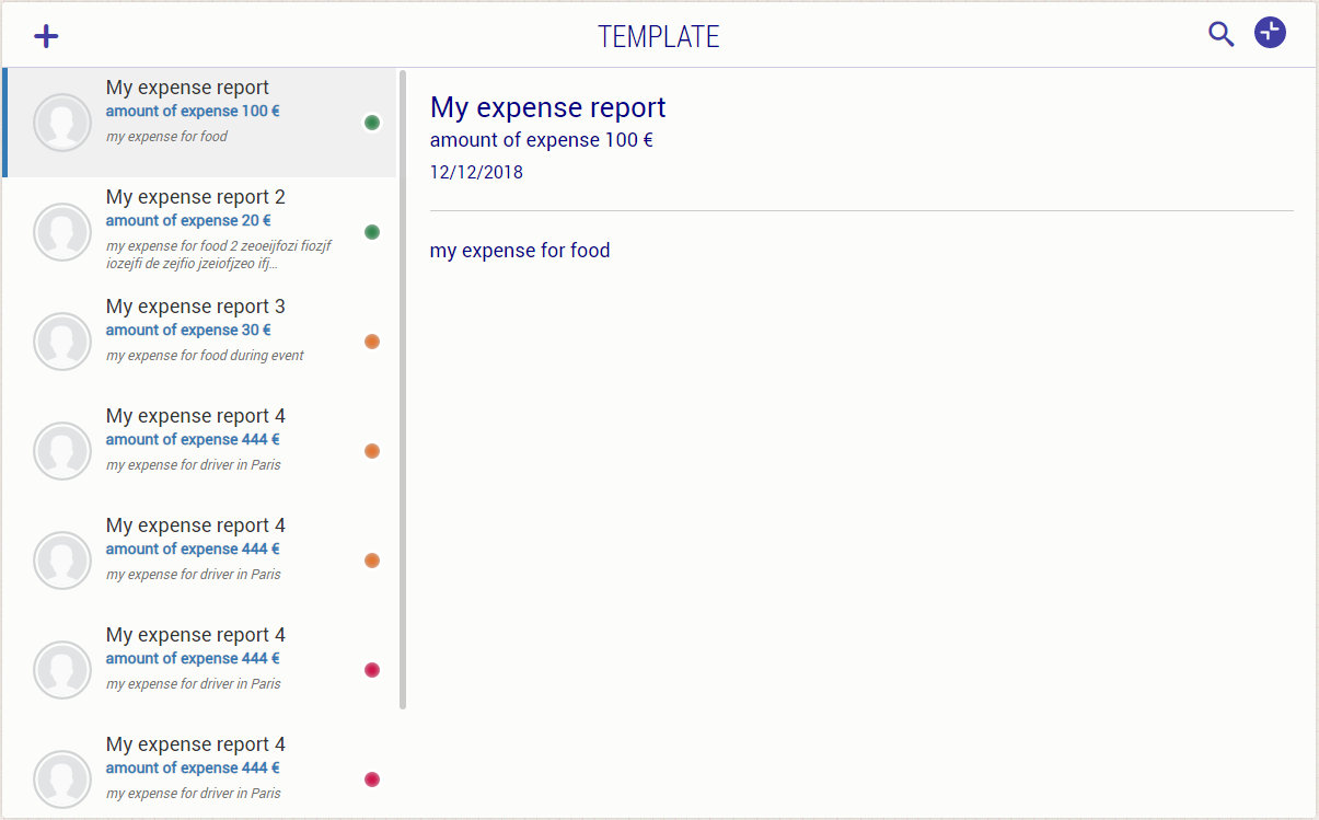
Table: It's the same React component used for normal widget. It will display on the full size of the enlarged widget. Responsiveness is also added on that component that will display table in tile if the width size of your explorer is less than 600px.
Create your widget
Internationalise labels
The resources folder contains the translated values for your labels.
Each file corresponds to one language, and contains a json object which itself contains a resource key and its translation in the relevant language. With the same content, a file named “default.json” is mandatory. It will contain resources with their default values. When a client uses a language that you do not provide, resources will be read from here.
For example, if you wish to display the text “Welcome” in French, English, and Italian in your widget, you must create the following 4 files in the folder:
default.json:

    {
        "labels": {
            "welcome-label": "welcome"
        }
    }
fr-fr.json:

    {
        "labels": {
            "welcome-label": "bienvenue"
        }
    }
en-gb.json:

    {
        "labels": {
            "welcome-label": "welcome"
        }
    }
it-it.json:

    {
        "labels": {
            "welcome-label": "benvenuto"
        }
    }
All these files must be provided in addition to the bundle file.
For a language you do not need to provide all resources, if there is no resource for a given key, the “default.json” file is read. That means that all resources must have a value in “default.json”.
This mechanism will make a client able to customize his resources only for him using the same GUI that already exists in Career application. As a result, it will be easy for a client to adjust the vocabulary or add his own language if it is not provided by default.
/**
   File : widget.conf.json:
**/
{
    "widgetName" : "template",
    "widgetScope" : "Me"
}
You define here the name of your widget and the scope (see scope managment section) to which the widget has to be associated.
Widget Configuration
     /**
     * File : host-mock.ts
     */
    configuration: {
        foo: "bar",
        fizz:"buzz",
    },
The configuration object of hostmock object contains any property required for the widget execution and that changes depending of where the widget is executed :
1-When you develop and execute your widget locally on your machine :
Example : You store employee's leave requests and you want to display them on your widget. You'll probably display data coming from a testing environment available with the following api :
http://partner-testing-environment/api/leaverequests
To do that, you'll have to :
- Add a configuration property in the configuration object :
     /**
     * File : host-mock.ts
     */
    configuration: {
        apiToCall:"http://partner-testing-environment/api/leaverequests"
    },
- Call the api and retrieve the leave requests in your code :
     /**
     * File : widget.tsx
     */
    const leaveRequests = await myTSHostService.requestExternalResource({verb: 'GET', url: this.props.params["apiToCall"] });
- Call the api and retrieve the data from Talentsoft API in your code :
     /**
     * File : widget.tsx
     */
    const leaveRequests = await myTSHostService.requestInternalResource({verb: 'GET', url: this.props.params["apiToCall"] });
2-When you want to deploy your widget in production and integrate it into each client's mytalentsoft portal :
Example : In the production, you no more want to display leave requests from your previous testing environment but from :
- http://partner-clientA-environment/api/leaverequests for client A
- http://partner-clientB-environment/api/leaverequests for client B
To do that, you'll have to :
- Build your previous widget with the build command yarn build :
You'll get a dist folder in your project containing :
- a minified javascript file corresponding to your source code : this file will be integrated into mytalentsoft client portal.
- a manifest.json file containing all the configuration properties : this file will be integrated into mytalentsoft client portal and all the configurations properties will be overriden by a mytalentsoft administrator, in order to have for each client environment, a distinct api url.
Rendering and behaviour
Customise your widget in this folder, specifically in the widget.tsx file:
-
Its structure (table, number of columns and rows, button, link…)
-
its behaviour (data loading, filling the structure with data, interaction with users when they click a link or button)
Imports
Firstly, you need to import the libraries that are essential to the proper functioning of the widget:
import * as React from "react";
import T from 'i18n-react';
import * as highcharts from 'highcharts'

// this import will only work with the typescript options
// esModuleInterop & allowSyntheticDefaultImports
import HighchartsReact from "highcharts-react-official";
import { WidgetProps } from "@talentsoft-opensource/integration-widget-contract"
import { uxpTheme, standardColors } from './theme'
import '../asset/widget.less';

import * as en from '../resources/en-gb.json'
import * as fr from '../resources/fr-fr.json'
-
Reactis the library used to create a widget. -
Tis the library that allows us to exploit the translations of labels stored in the resources folder. -
Highcharts,uxpTheme, andstandardColorsimports allow you to use the pie chart graphic component -
WidgetPropsprovides the properties and methods that you can call (application language, services allowing redirection to a new url given in paramètre…) -
The
widget.lessfile (present in the asset directory) defines your widget’s style.
Life cycle
The componentDidMount method is called when the widget is loaded.
With this method you can call up the data you want to display in your widget, and store it in the state.
Once your widget is ready to be displayed, you need to define the host by
calling the following method: setDataIsLoaded.
render is called at each change in the widget’s state (via setState).
Define there the html structure of the widget.
Api accessible in the widget
Widgets are react components whose properties (i.e. the configuration used when
the widget is initialised) are defined in the interface WidgetProps.
You’ll find the reference documents here. The page which
particularly concerns WidgetProps is here.
Test your widget in a Talentsoft environment
Make sure you have build your widget before going further.
If you have any talentsoft application available, you can use it to test and see your widget rendering in mytalentsoft portal :
- Go to your talentsoft application
- Go to Administration/Roles & Rights and make sure you have the following right : Module : Administration Sub-module : My Talentsoft Right : Add a test marketplace partner (for test only, don't use in production)
- Go to Administration/Marketplace partners
- Click on the button 'Add a test marketplace partner (for test only, don't use in production)'
- Fill up the submit form like this : Name : You must indicate here the name of your widget (it must be the same that is written in the field WidgetName of the file widget.conf.json in your widget project) File properties : Upload here the csv file located in the dist folder of your widget project File widget bundle : Upload here the js file located in the dist folder of your widget project
Send widget to Talentsoft
Sending partner widgets to Talentsoft is done through Bitbucket. You need to add a workspace and create a repository for the partner that deliver a bundle.
After pull request is created on Bitbucket you can go through review processes.